Metropolitan Age Structure in the United States
We live for just these twenty years
Do we have to die for the fifty more?— David Bowie, “Young Americans,” 1975
This is an attempt to build a typology of age structures throughout the United States, covering 387 metropolitan statistical areas and 3,144 counties. While median age is the usual population statistic used to assess whether an area is comparatively young or old, this is a poor way of distinguishing between places with radically different characteristics in terms of age distribution and aging-in-place. This analysis provides the tools for understanding what makes a high-fertility exurb, a garrison, a college town, and a working-age magnet economy different from one another.
Data source
Census Bureau Vintage 2025 population estimates, released June 2026. Every cached file is recorded with its source URL, byte size, SHA256 and retrieval timestamp in the source manifest.
Age structure has shapes, not just averages
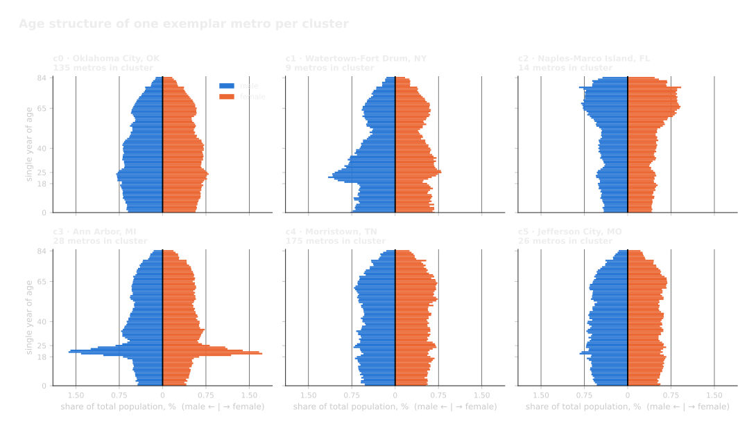
Nine shape-based features per metro help to define their population types: modality count, a dissimilarity index, group-quarters share by type, sex ratio at 18–29, and the under-18 and 65+ shares. College towns, retirement destinations and aged-in-place metros each come out cleanly.
However, high-fertility metros, border and agricultural metros, and prime-age magnets collapse into a single shape-based cluster, and require a separate instrument to recognize.
Cohort progression
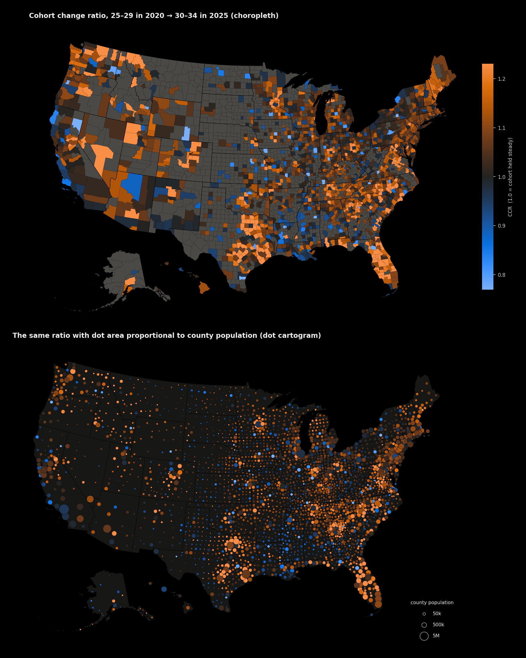
That separate instrument is the cohort change ratio: if we follow one birth cohort between two
dates, we can see whether the county retains a cohort over time or churns through. This analysis
looks at the cohort change ratio by comparing each area's 25–29 population as of 2020 to its
30–34 population as of 2025: CCR = P(30–34, 7/1/2025) ÷ P(25–29, 7/1/2020).
Above 1.0 the county gained that cohort; below 1.0 it lost it. It is age-specific and requires no assumption about where migrants came from.
Composite magnet index
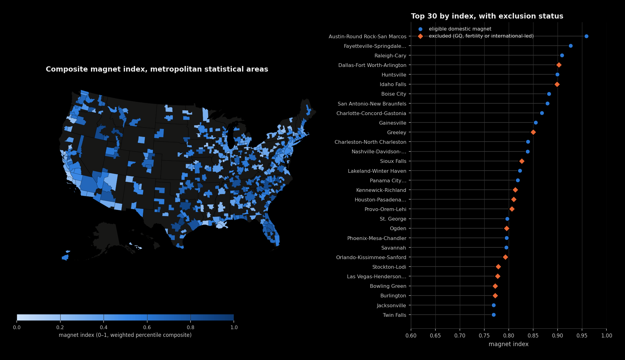
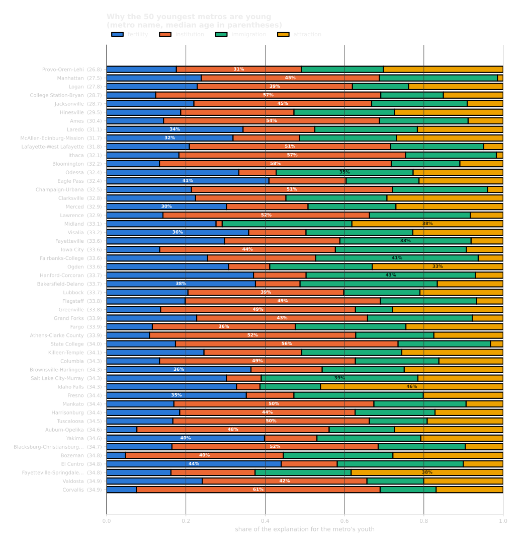
A metro can be young for reasons that have nothing to do with anybody choosing it. Births make a metro young. So does a barracks, or a campus, or a farm labour force. Only one of the four is a decision an adult made about where to live, and it is the only one most people mean when they call a place a magnet.
The magnet index measures that directly, and it asks three questions of every metro. Does it keep the people who arrive in their late twenties and thirties, or do they leave again by their mid-thirties? Are jobs in that age band growing there? And when Americans move between metros, does the flow run toward this one or away from it? A metro scoring high is winning working-age adults from the rest of the country. A metro scoring low is losing them, whatever its median age says.
Why some metros are young
Methods
Everything above is produced by make all: fetch (cached, with a manifest), build,
analyse, validate, figures, interactive map, report. Mapping is Albers Equal Area (EPSG:5070) with
Alaska (EPSG:3338) and Hawaii (EPSG:26962) reprojected, rescaled and inset. Additional details are
in the technical report.